QuiCQ 16/04/2024
Conundrum
Prefer to read today’s QuiCQ in PDF format? No prob, download it here!
"Usually, the main problem with life conundrums is that we don’t bring to them enough imagination."
-- Thomas Moore
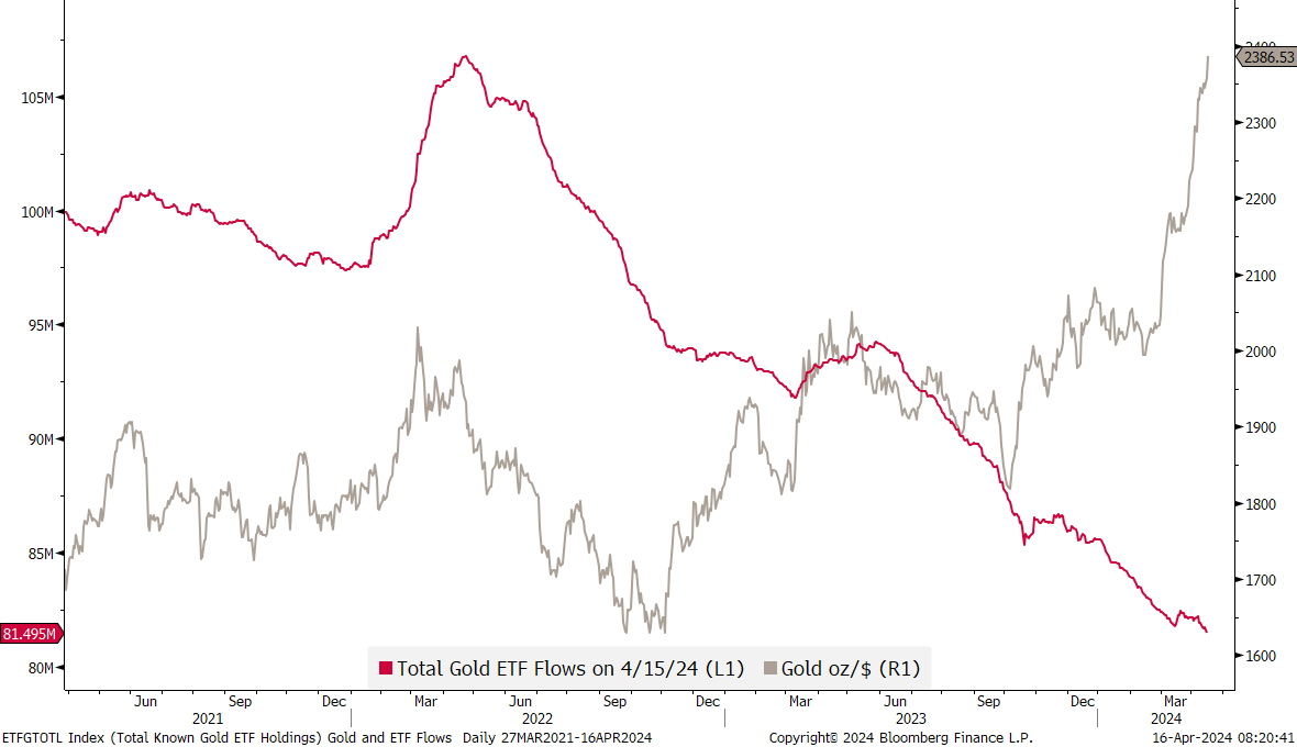
Here’s a conundrum chart for you: The grey line (rhs) shows the price of Gold in USD per ounce. The red line (lhs) shows total flows in and out of Gold ETFs. So, how can Gold go from record high to record high, whilst the demand from investors is dwindling? Is it all due to heavy central bank buying? Unfortunately, we do not know that latter data point for this year yet, as updates on CBs buying is only updated quarterly. Stay tuned for now …


