

The Q - Daily Edition - 10/6/2026
Devilish!
“Pressure can burst a pipe, or pressure can make a diamond.”
— NBA champion Robert Horry (aka "Big Shot Rob")


Remember that famous March 6th 2009, bottom in the S&P 500, a day where the index had hit a devilish intraday low of 666?
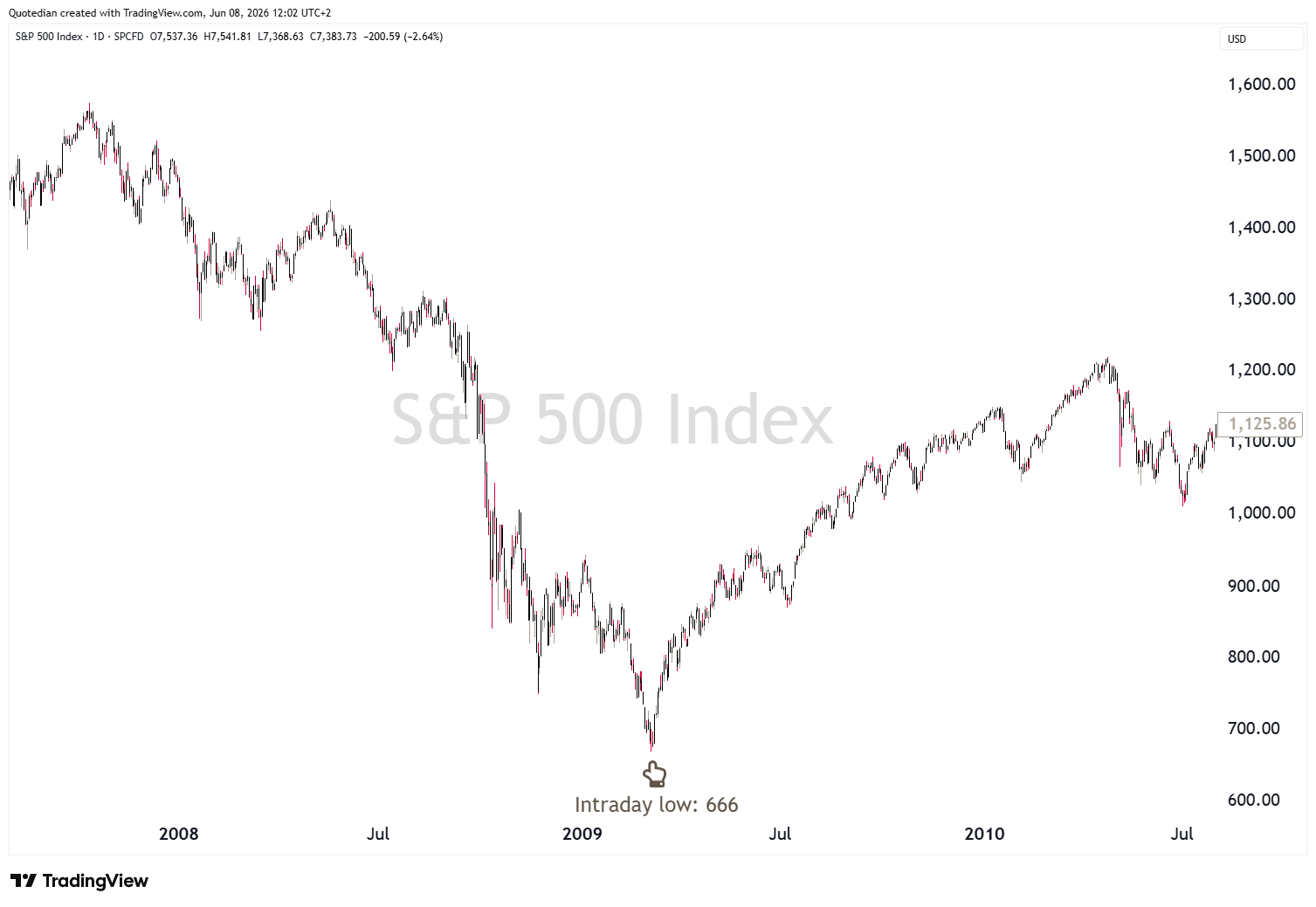
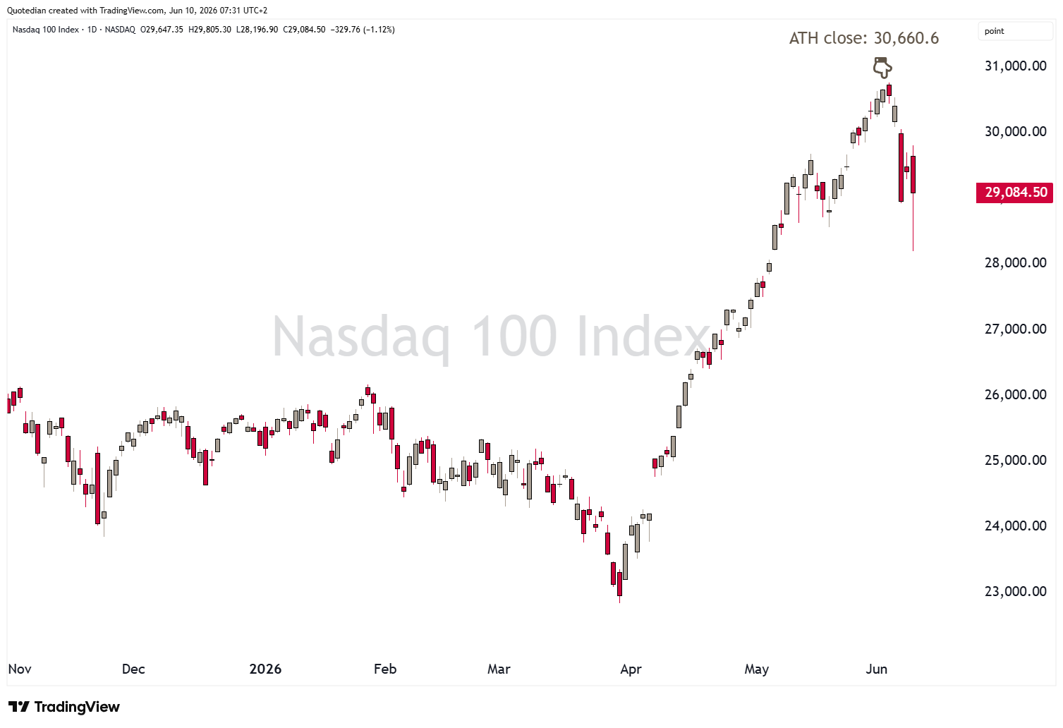
Well, what if, and only what if, that 2.6.2026 (so far) ATH closing high at 30,660.6 was devilish enough to mark the end of the entire 27-year secular bull run?
Just imagine!

Anyway, taking my tin-foil hat off again, let’s have a look at some of the price movements over the past twenty-four hours or so…
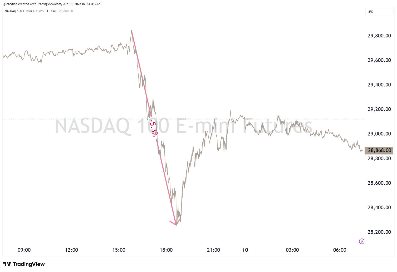
Yesterday, felt very much like a repeat of Friday … with stocks down strongly in headlines (though admittedly a respectable bounce took place in the late hours of US trading), but looking under the hood gave more positive picture. In parts…
Here’s the intraday chart of the Nasdaq-100, down well over five per cent from its peak about an hour after the European market close:
By sheer lack of having anything else to do, I actually checked in on the sector performance right about at the time of those lows and found a surprising (or not) sector performance table for the S&P 500, which differed only in numbers from the one we had by the time of the closing bell:
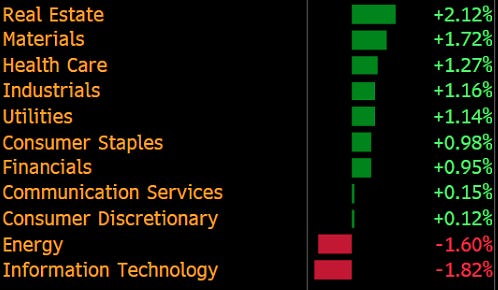
In other words, the entire sell-off was coming out of two sectors, which is then also reflected in a nearly 3:1 ratio of advancers (371) versus decliners (131), leaving us with a heatmap where green dominated, at least in terms of ‘most seen’:
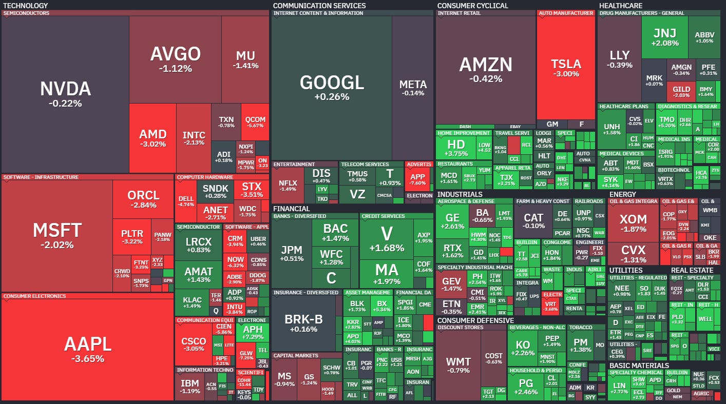
(Note to self: somehow I feel that passive, market-cap-weight thematic will dominate investment news headlines over the coming months to years).
As we showed in a chart in the weekly Quotedian, dubbed “June Swoon" (click here), in (US election) mid-term years, we are now in “the difficult period” - check out the chart-of-the-day further down.
A possible target for the current ‘correction’ is around 7,000 on the S&P 500, as we also highlighted in our weekly issue published on Monday. Here’s the update version of that chart, with the dotted points being possible zones of support:
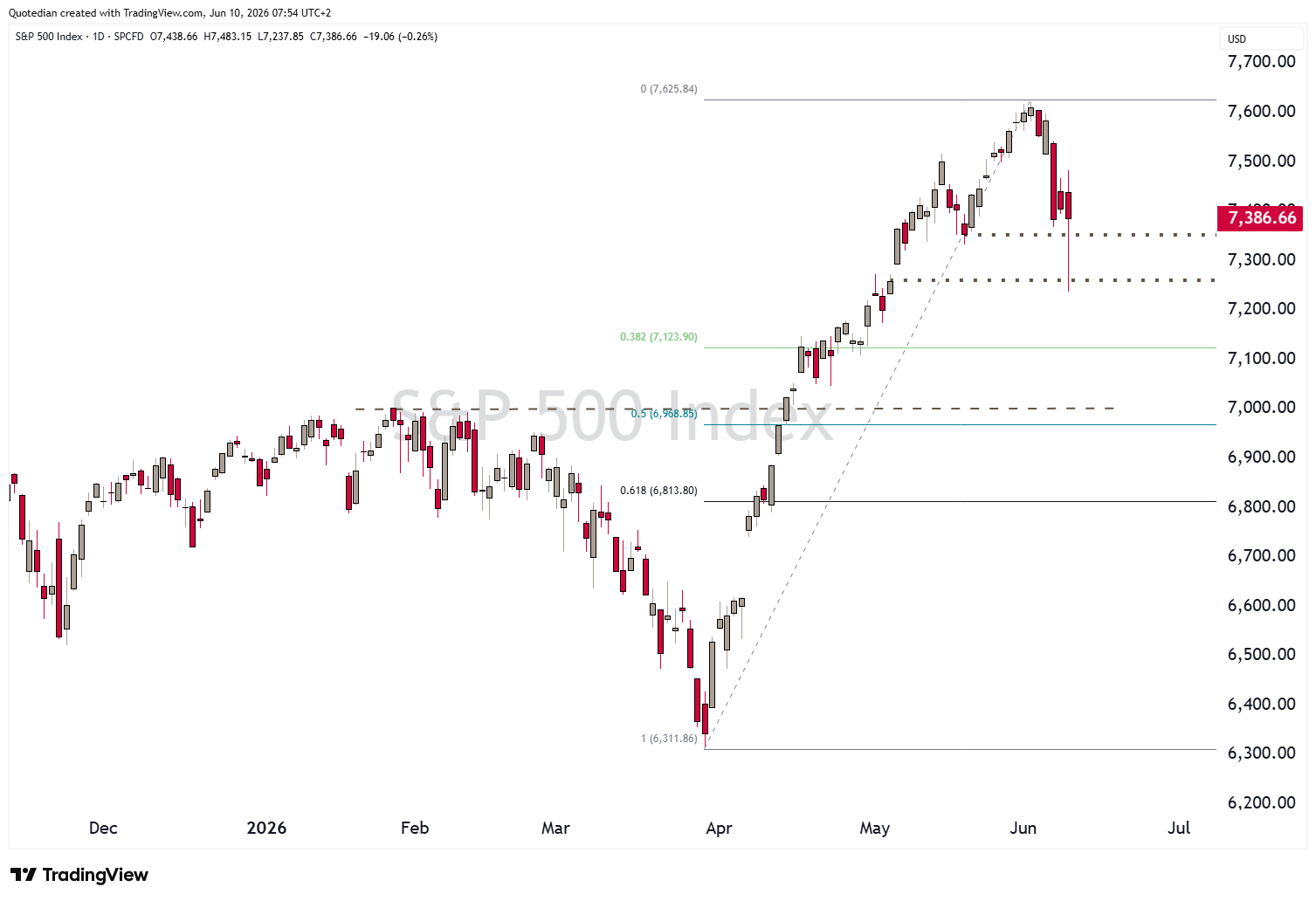
Please note: Target ≠ Forecast
Another asset class that was on the move yesterday, with follow through in Asian trading this morning, was Gold:
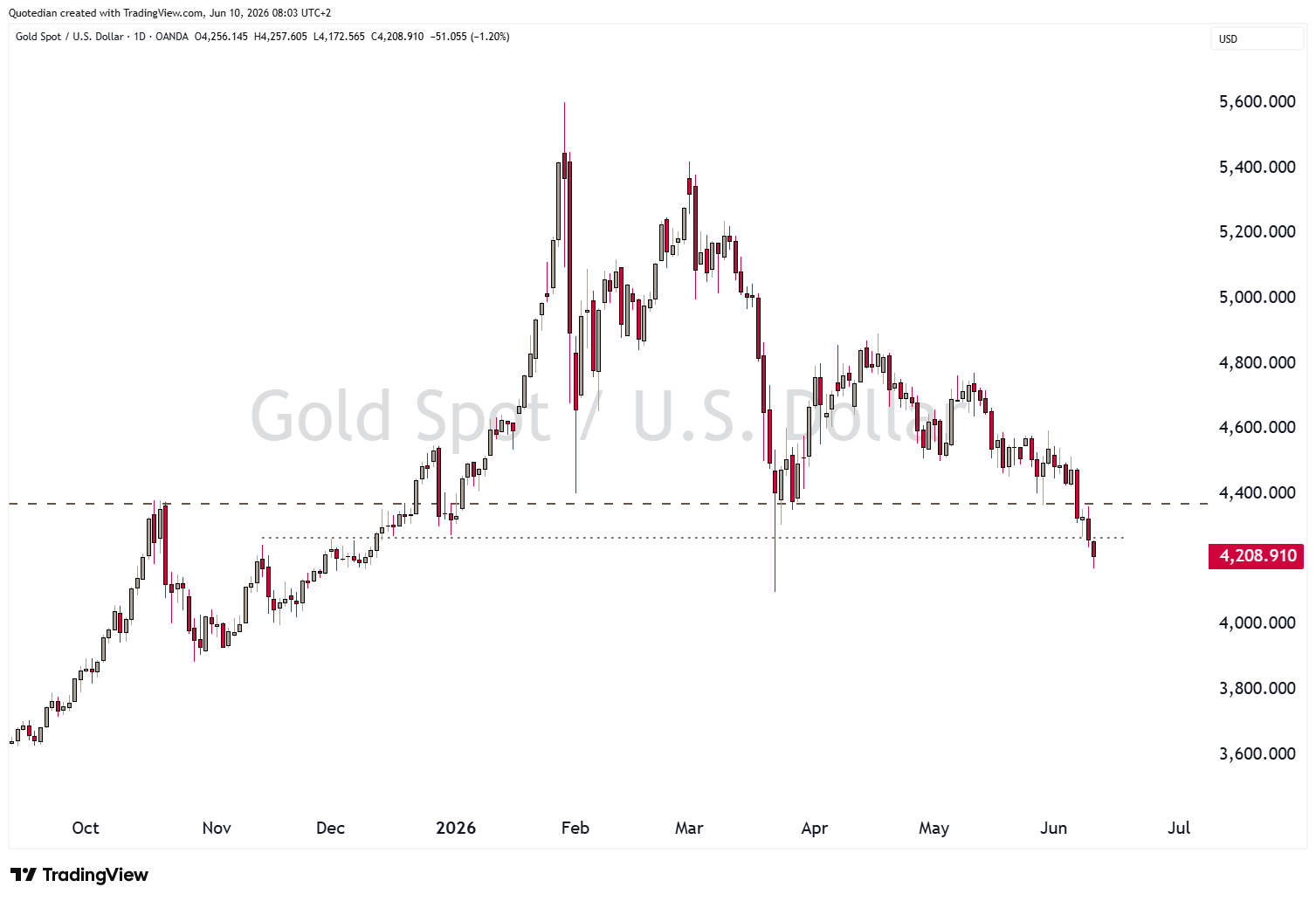
Right now, including today’s candle, which is the most far-right one on the chart above, the yellow metal has broken just about any key support.
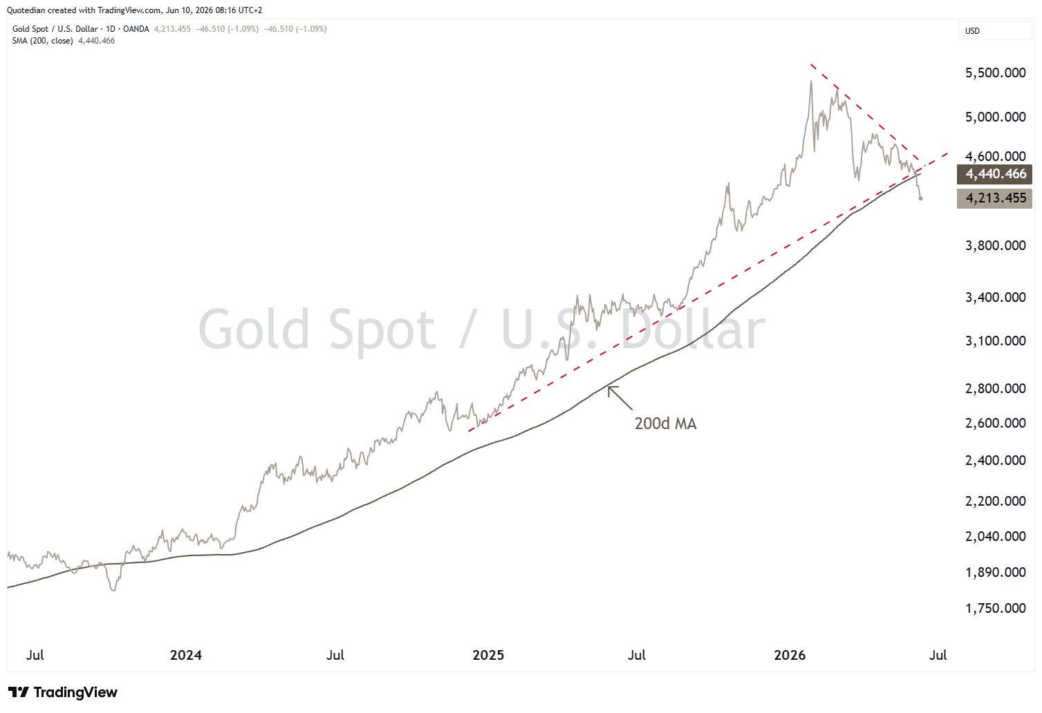
As things stand, it is difficult to come up with a bullish chart right now and this one looks particularly ugly:
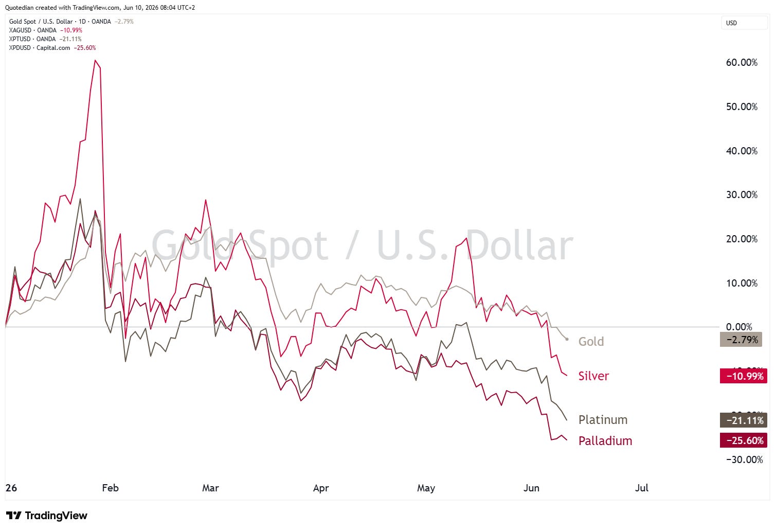
Albeit negative now, Gold is still the most precious amongst the precious metals on a year-to-date basis:
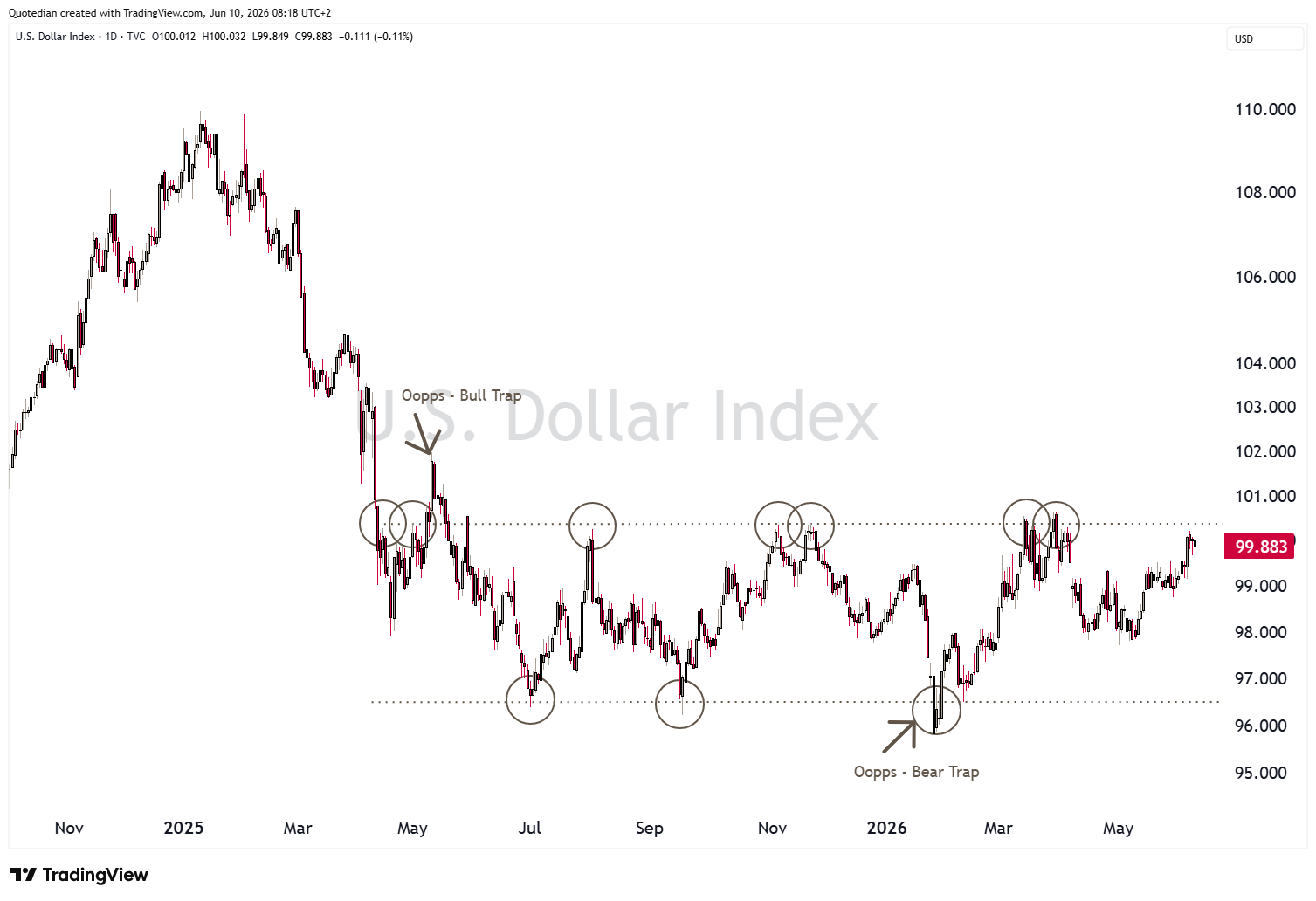
The US Dollar Index (DXY) continues to creep towards the upper end of its year-long plus trading range:

Today’s chart-of-the-day shows the average monthly returns for all calendar months in US midterm election years going back over 100 years (1922):
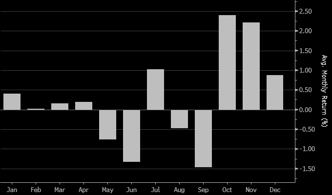
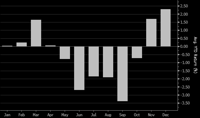
Clearly, returns have decreased, and volatility increased in the months leading up to the November elections, which was then followed by a year-end rally. For comparison, here’s the same statistical chart going back to the beautiful year of 1970 (aka modern times) only:

Clearly, today’s market focus will be on the US CPI number:
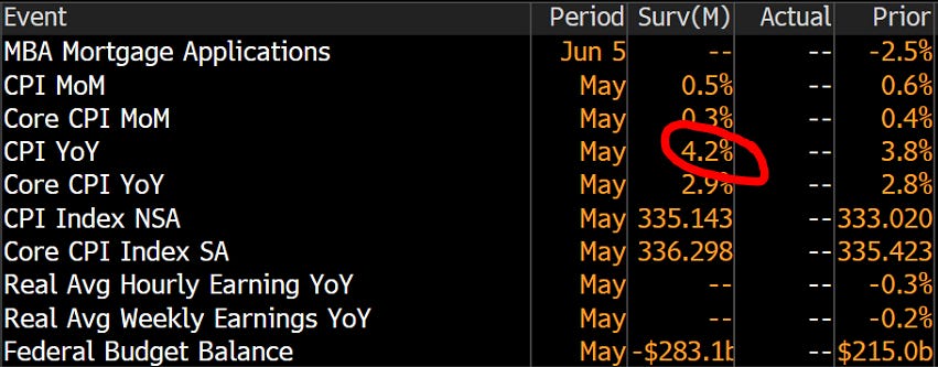
Generally, a number above 4% is considered as possibly difficult for equity markets …
In that context:

André

Everything in this document is for educational purposes only (FEPO)
Nothing in this document should be considered investment advice
Investing real money can be costly; don’t do stupid shit
Leave politics at the door—markets don’t care.
Past performance is hopefully no indication of future performance
The views expressed in this document may differ from the views published by NPB Neue Privat Bank AG